The UFC 300 Poster is Perfect for the Promotion in 2024
Or, the fighters don't matter, only the brand
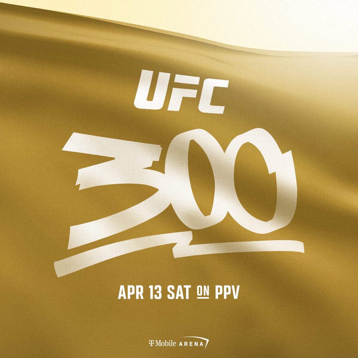
The reaction to the UFC 300 poster was swift and severe. Very few people liked the poster when they first set eyes on it. Me? I found the image of a gold flag waving in the breeze with UFC 300 written in white to represent the historic event perfectly. Let me explain.
The posters the UFC uses to advertise its events are often lazy affairs. Like most pieces of the UFC production puzzle, the UFC has a formula it follows, one that it is comfortable with. The graphics department usually opts for large images of the two main event competitors facing each other. Sometimes, if there are other noteworthy fights on the card, the promotion includes smaller images of those athletes below the main event fighters. Here are examples of all the posters the UFC has put together for 2024.
The poster for UFC 300 removes any fighters, which is a head-scratcher because UFC CEO Dana White wants fans to believe that the upcoming event, scheduled for April 13 at the T-Mobile Arena in Las Vegas, will be the grandest event the UFC has ever staged.
'How do we make 300 different than 100, 200, and anything that we've ever done?' What I wanted was, I wanted it to be, when the first prelim of the night starts, you have to be in front of your television. You can't miss one fight on this card," White told TNT Sports.
"So, when you look at 300 right, we have 12 current and former UFC champions or interim champions, seven pound-for-pound [ranked] fighters, almost every single fight features a ranked contender, 16 ranked fighters in total. And it's expected to break every record at the T-Mobile Arena with a $15 million gate. So, UFC 300 is the greatest combat sports card ever assembled."
What White describes is an event that could have, and perhaps should have, had the images of all 26 fighters emblazoned on it. That poster, once all the fighters signed it, which the UFC requires the fighters to do during fight week, could have generated a lot of sales at a premium price. Much more than the $2,000 asking price of the UFC 299 poster. Instead, the UFC opted not to include a single fighter's image or name on the promotional object, despite two legitimate UFC titles being on the line and one made-up belt also up for grabs on the card.
So why is the poster perfect? Because it acknowledges two things. The first and obvious one is that no fighter is bigger than the brand. The second is that it harkens back to 2001 when Frank and Lorenzo Fertitta purchased the fight organization, and what they got for $2 million was three letters and a floundering promotion. Those three letters were the most important pieces of capital back then and remain so to this day. Nothing meant more to the Fertitta brothers than those letters from 2001 through 2016 when they sold the organization to WME-IMG for $4 billion. Today, WME-IMG, which rebranded as Endeavor in 2017, owns the UFC and WWE under the TKO ticker symbol. The value of TKO is pegged at more than $21 billion.
Is the poster a slap in the face to the fighters who create that value? No doubt, but the UFC has never treated its fighters, who are all independent contractors and don't get any of the benefits afforded athletes in other sports that have players associations, as anything more than interchangeable cogs that they can easily replace once the organization has extracted the maximum profits it can from their damaged and depleted bodies.
The mask is off with the UFC 300 poster. The promotion is reveling in the fact that it knows its fans will tune into the event not because of the fighters, but because of the three letters that adorn the poster.


fire this moron immediately